Welcome to our next update on the Match Fit Initiative! In this article, we will be covering how Ultimate and Enhanced Editions will work now
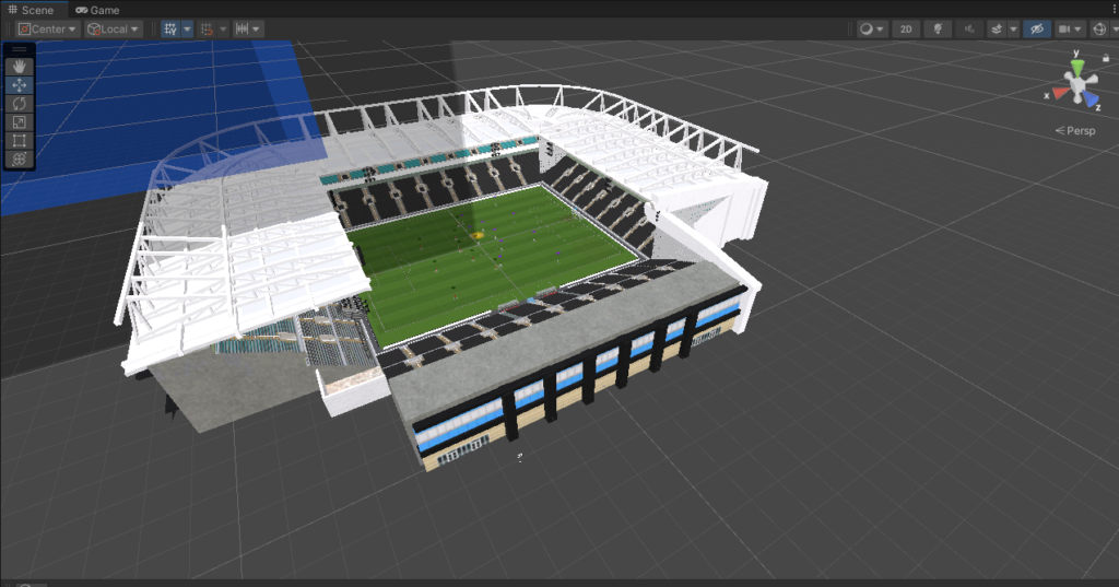
This year, our focus for the Soccer Manager series is on delivering a game that is match fit. Our overriding focus is on building the
The biggest Soccer Manager update of the year is here – the 2.1.0 transfers update has arrived! Our main focus for this patch was updates