In this week’s Soccer Manager 2026 Deep Dive, we’re going to be taking a more detailed look into the new UI coming this year. There’s a lot more to it than just an (admittedly gorgeous!) all-new colour scheme, so let’s dive into it.
Why Change the UI?
After the launch of Soccer Manager 2025 last year, we decided to take a deeper look into the UI and really look at stripping it back. In a game like Soccer Manager, where new features are being released every year, it’s easy to just slowly add new buttons on top of new menus and, after a few years, end up with really complicated design. The additions to the game slowly start to add up; one button here and there doesn’t make much difference, but after a decade of bringing new features to the game, it was time to take a step back and think about how we can do everything better.
With that in mind, our overall philosophy for the UI in Soccer Manager 2026 wasn’t just to reskin it and call it a day. It was to really dig through the game and find things that were buried, easily missed, or just otherwise harder to use than they should be, and bring them to the surface. What was also important to us, however, was that we didn’t change things for the sake of changing things. When you embark on a project like this, it’s easy to just decide to move everything around and create something totally new. We didn’t want to needlessly complicate the transition from SM25 to SM26 by moving things that were fine, so we had to strike a balance between redesign and maintaining what already worked.
What’s New?
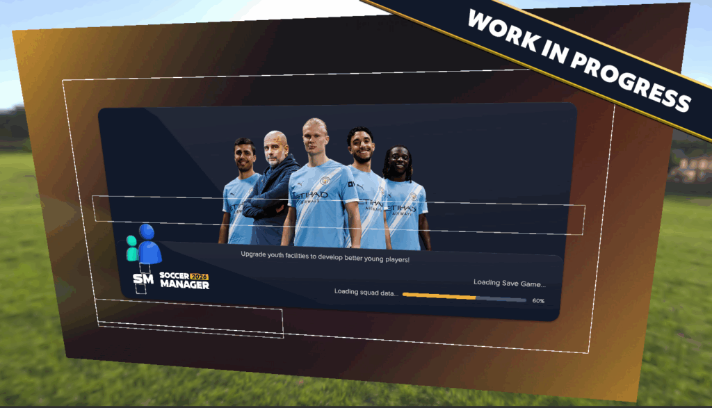
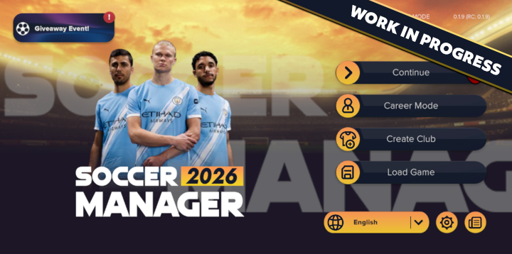
Plenty! Nearly every screen in the game has had work done to it beyond the new colour scheme and rounded designs. The first one you’ll probably notice when booting up the game, for example, is the new main menu. We’ve moved away from the boxy buttons of different sizes that were in SM25 and now all of the buttons are of equal weighting in more of a list format. This has made the main menu more readable and is a great example of the sort of work that we have been doing.
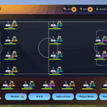
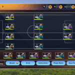
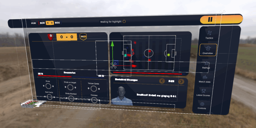
One of the biggest changes in the game has been changes to navigation. The left-hand menu in SM24 was useful for getting around, but was quite cluttered and was always present, leading to it being removed in SM25. This year, we’ve reintroduced it in a new way. This left-hand menu is now accessed through pressing a button (meaning it isn’t always taking up valuable screen real estate) and contains quick links to all of the major screens in the game, giving you a handy way to quickly get around from screen to screen. The search function has also been moved into this menu to free up some space on the busy top bar. The button for this menu will stay on the top bar through every screen, meaning it’s always on hand for you to jump between your facilities and your squad, rather than always having to back out to the main menu.
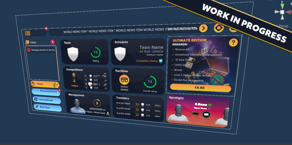
The main overview screen has seen a bunch of quality-of-life tweaks too. Your tasks have been shrunk down and moved to a sliding bar at the top, once again freeing up some space. Thanks to this change, you’re also able to see multiple available tasks at a time, rather than having to slide through them one-by-one. If there’s something critical at the back of the queue, there’s no more sifting through other tasks before you get to it.
Whilst those are just a few of the major changes to the UI, we’ve also made a few minor tweaks here and there. There’s now a dedicated objectives button to go along with the new system. The Shop and International Management buttons have been moved into the space once occupied by objectives, giving more space to the main elements of the overview screen. Similarly, world news has been moved up to the top of the screen, again so we could expand out the buttons that are needed the most. There’s plenty of tweaks like this throughout the game that just make the experience much more intuitive!
The Colour Scheme
Of course, whilst we redesigned the practical elements of the game, it wouldn’t be a new Soccer Manager release without a new colour scheme. For this year, we wanted to go with something a little bit darker and more modern than the brighter scheme of SM25. To achieve that, we opted for the scheme of navy and gold. Or black and orange. There’s an ongoing debate in the office about which it is.
The new colour schemes every year are a way of bringing a fresh identity to each iteration. We’re always striving to make each Soccer Manager game a new experience, and the overall look of the UI is a big part of that. The new colour schemes are a good way of defining each installment. Plus, we love hearing the conversations about which year’s colour scheme was the best – we’re hoping that this year’s will be a big part of those chats.
The Future
A lot of work has been done between Soccer Manager 25 & 26 to make the UI easier to change. After a decade of constant iteration, there were some things from the past that we thought we could do better. As we’ve gained more experience as a company, we’ve learned faster, more efficient, and just plain better ways of working. We’ve spent quite a lot of time putting some of these lessons learned around the UI into practice over the last year.
To you as a user, this doesn’t always make a visual difference. When we make changes to the infrastructure of the game, we always try to make sure we’re not disrupting the user experience much (if at all). The changes to the UI on the backend, therefore, are more to make it easier to work with. What this means for you is that future feature additions will look better, maintain a consistent visual identity with the rest of the game, and be more responsive than before. This has all been done in keeping with the Match Fit Intiative as we’ve sought to make SM26 the most stable & bug free experience in the series’ history.
Wrapping Up
Thanks for having a look through the new UI with us! We hope that you are finding these Deep Dives useful, and if there’s ever anything you want to hear more from the team about, feel free to let us know over on our Discord server. We’re always on the lookout for new ways that we can let you all have a look behind-the-scenes, so send us your ideas!
Next week, we’ll be digging deep into the revamped Manager Traits system, including the fully-fledged skill trees that are making their way into the game later this year.